OPEL ‘FROM COLD TO COOL’
Corporate identity refresh
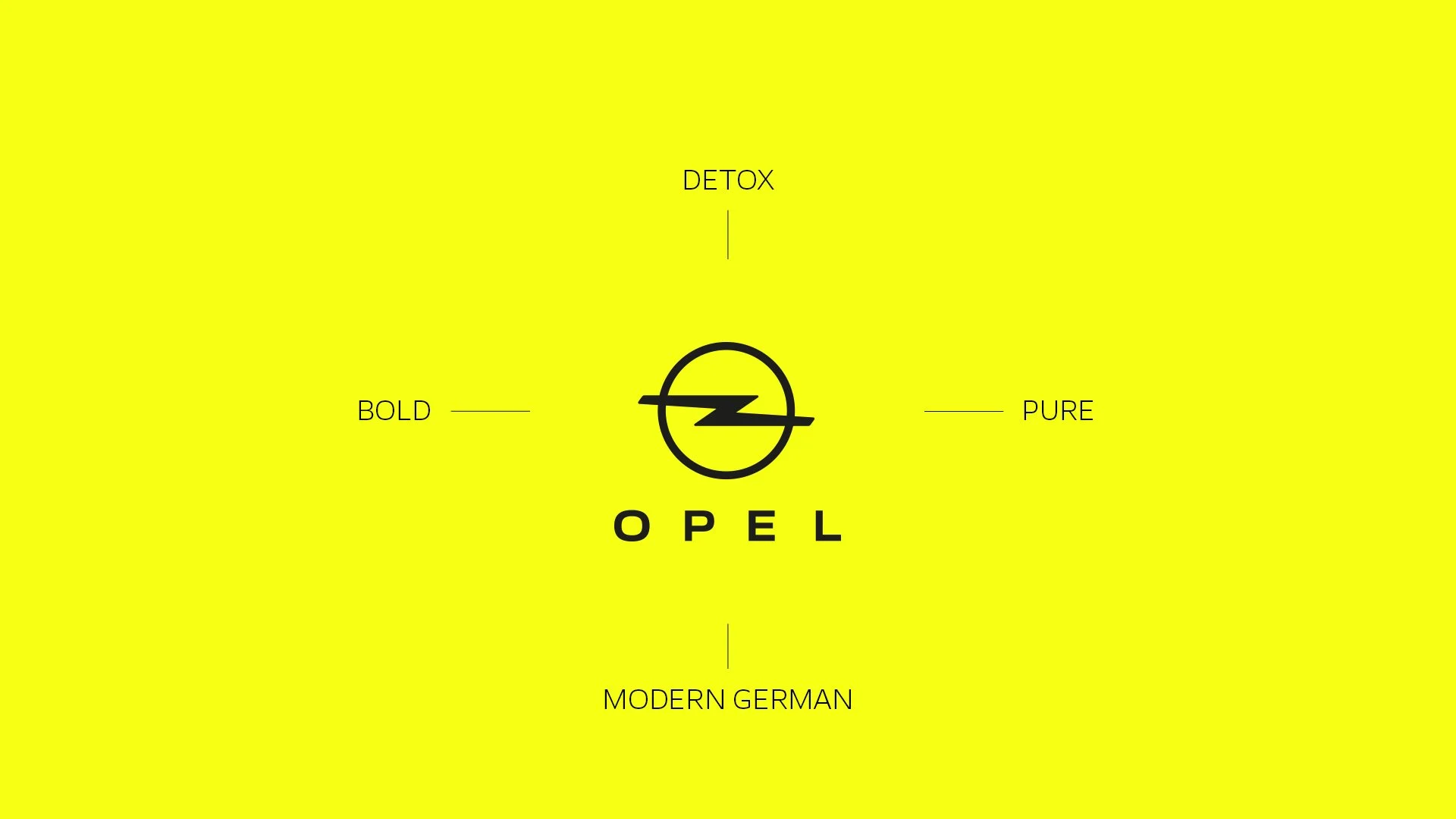
Opel begins a new era with its refreshed CI. As a modern German brand we wanted a clear design and brand elements that represent the brand in an unmistakably progressive, bold and pure way. From Cold to Cool: Opel's CI refresh has emerged not from the drawing board, but naturally from its DNA and founding spirit. The ‘New Opel’ look translates this spirit into a distinctive visual language.
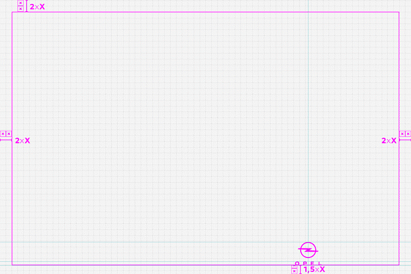
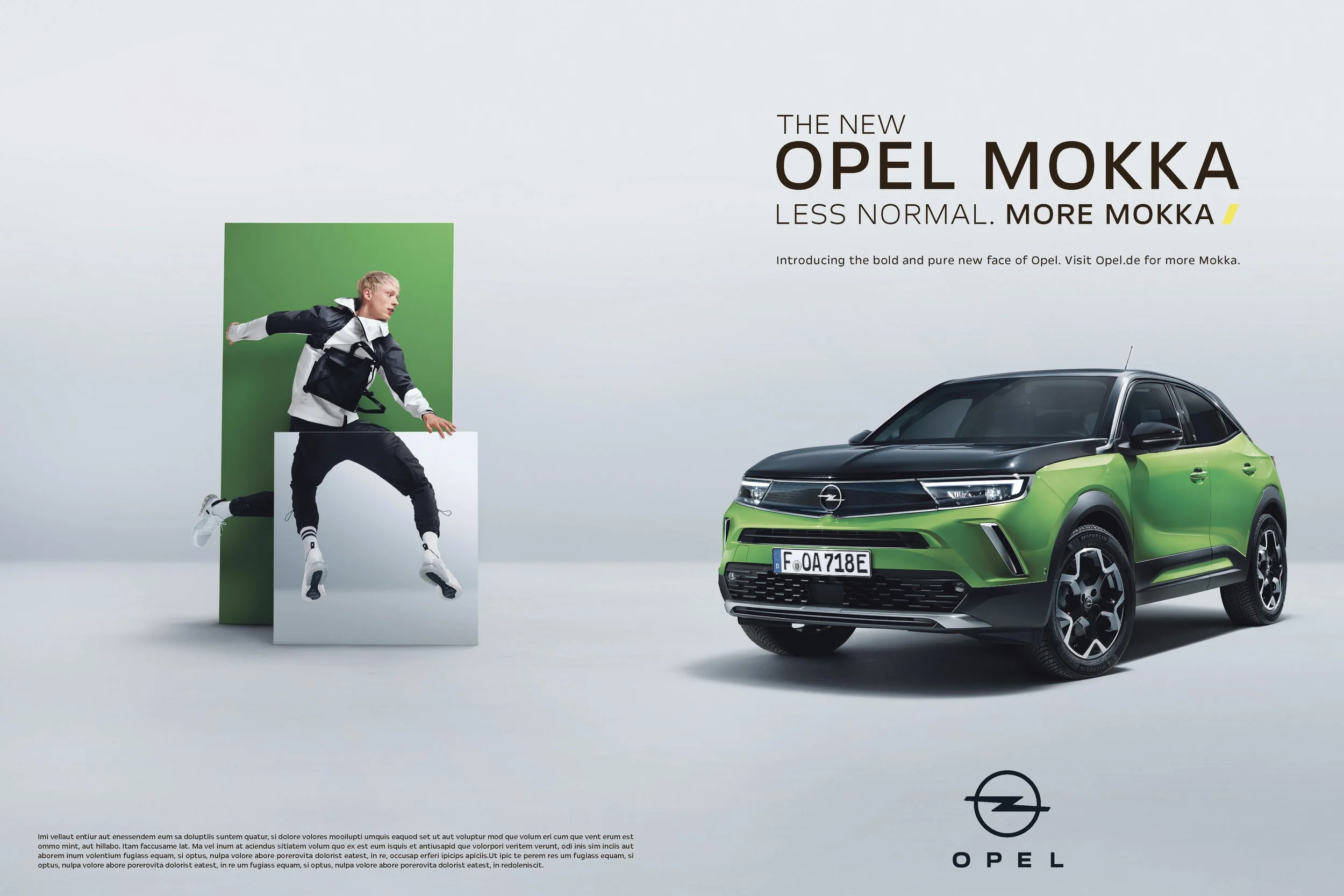
One of founding principles of Opel’s new design language is the clarity with which it focusses on the essentials, dispensing with frills and distracting elements. This is the mantra of ‘Bold and Pure’. The Opel logo has evolved to recenter focus on the lightning-flash, making the ring slimmer and emphasising the brand. The new font is called Opel Next, made to be light but powerful, modern and clear. It’s three variants Light, Regular and Bold complement each other perfectly, ensuring a consistent voice. The new Opel Yellow symbolises electricity, the new fuel in the electric age. The colour electrifies, imprints itself, and helps create a unique identity.
A small core team of us worked closely with the team at Opel to develop the refreshed CI - an updated logo, a new font, new brand colours and brand new CI guidelines to go with it. These guiding principles helped bring the CI to life consistently across any channel, in any format and in any market where Opel is advertised.


©Opel and Frederic Schlosser Photography

©Opel
Credits:
Client - Stellantis
Client partner - Quentin Huber / Mikael Deschamps (Opel)
Agency - McCann Frankfurt
ECD - Donovan Bryan
CD - Marion Bryan / Norman Henkel
Designer - Marion Bryan / Lars Schulte / Jan-David Winter
Motion Graphics / Editor - Alexander Rung